Why Responsive Design is Preferred?
Responsive design is a fairly new direction in the design of web resources. However, it is now one of the main indicators of site quality. In this article, we will give information about what responsive web design is and how it can be. What is responsive web design? Let’s examine it together.
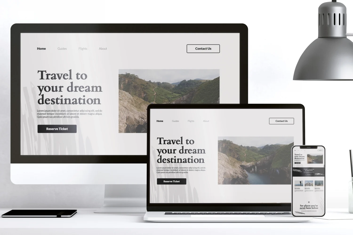
Responsive web design is the design of web pages that provide a great experience on various devices connected to the internet. It means that one and the same site can be viewed on a wide range of devices (smartphones, tablets, laptops, etc.) regardless of resolution and screen format. At the same time, the display will be equally suitable for all formats. For example, mobile device users will no longer need to expand certain areas of the site to avoid missing the desired link. This will allow users to have a much better experience. Resposinve web design aims to match the display of web pages and their content to the device on which they are viewed.
Why Responsive Design is Necessary?
According to the latest research by the NS Web Index, only 29% of users have visited websites from computers in the last few years. However, more than half of the people surveyed use computers and smartphones or tablets. In this direction, we can detail the importance of responsive website as follows.
1) Provides a comfortable experience on a wide range of devices from which you can access the internet. Currently, there are many devices that people use, including to access the internet. These devices all differ in terms of screen size, resolution and therefore how the website can be viewed. So no matter what device people are using, it’s important that your site looks good and displays correctly on any of them. Otherwise, it is extremely likely that users will move away from your website and therefore from your company.
2) The popularity of mobile devices with internet access and the increase in mobile internet traffic. With the growing popularity of mobile devices, the number of users visiting sites from these devices has increased significantly. It is therefore no longer possible to ignore them. It is not one or two people in six months. This is an important part of your target audience and the structure of your site should be appropriate for them.
3) Desire for urgent information. If your resource contains news/urgent information and there is a high probability that the user is currently reading this information on their phone (because they don’t have other devices at hand), you definitely need to make sure that your website has a responsive design.
The Difference Between Responsive Design and Mobile Version (Application) of the Site
Mobile versions of sites and mobile applications designed specifically for various mobile devices also solve the problem with the usability of the site, but they have some disadvantages. These are as follows.
1) Each type of operating system needs its own application/version of the site. This requires additional resources, both in terms of time and money.
2) The need to download the app arises. To use your app, users need to download it. This requires a little more effort from users, and many will not do so unless they are sure they really need the app and plan to use it regularly. For this reason, since there is no need to download the responsive website, it is much more attractive to users.
3) Separation of traffic. In terms of website promotion, the mobile app is not suitable as it splits all the traffic of the resource into the site’s traffic and the app traffic, which will look like less traffic to the site.
4) The need to integrate site materials, products, graphics, images. In case you use a mobile app, you should synchronize the site with the app (additional resources) or work twice to populate the site and app with materials.
Unlike mobile apps, responsive design is one site address, one design, one management system and site content. Of course, responsive design also has its disadvantages. The most important of these is the relative newness of the technology and the consequent lack of good experts and knowledge in designing responsive sites.
Principles of Responsive Website
The design starts with a responsive mobile website. At this stage, designers try to accurately convey meaning and main ideas using a small screen and a single column. If necessary, content is shortened, secondary blocks of information are removed and the most important ones are left.
Design for mobile devices is prepared from the initial stages,
A flexible, grid-based layout is applied,
The use of flexible images is realized,
Work with media queries and
Incremental remediation is applied.